Architectural Innovation – breaking the rules of architecture in 2017
We’re at the front edge of technology in a way that has never been true before. With the plethora of tools, programmes, and techniques available, there’s almost no limit to potential for human creativity. One thing is for sure: four straight walls and a peaked roof are far from mandatory in this brave world. The only reason to stick with those conventions is because you really want to.
The new normal is to think outside of the box – literally.
Instead of being bound by the conventions walls, floors, and roofs, architects are liberated to be able to plan for people and processes.
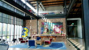
A great example of this kind of freedom in thought and design can be seen clearly in the Pixar head office. Pixar’s Chief Creative Officer, John Lasseter, believes that an atmosphere of freedom boosts creativity. One of the genius innovations in this space is the gigantic atrium, home to the reception area, staff mailboxes, café, theatre and more … including (until recently) the only loos on the campus.
The director of Ratatouille and the Incredibles explains the thing behind what might at first seem like a waste of space:
“The atrium initially might seem like a waste of space…But Steve realised that when people run into each other, when they make eye contact, things happen.”
And it worked!
John Lasseter describes the result:
“…I’ve never seen a building that promoted collaboration and creativity as well as this one.”
What we can learn from Pixar:
- Plan for spontaneous, collaborative collisions.
- Make the workplace fun, within the scope of the work being done. People will be more productive – and more present – if they work in a place they love, and they want to go to work each day.
- Let employees express themselves within their work environments. Modern teams often spend more time in the office than in any other activity. It makes sense that they want to feel a sense of connection to the place that, for many of them, defines the bulk of their living space.
- Release creativity. Cubicle farms are the death of creativity – and no longer necessary. Take a leap and design spaces around the people who will use them.
Here are some inspiring spaces that prove that four walls and a peaked roof just aren’t the only option anymore:
- Bosjes Chapel with its undulating roof
- Shenzen Boan International Airport
Size counts – as long as you’re thinking SMALL.
Our global population has just topped seven and a half billion people. Finding the resources to feed, clothe, and house all of us has never been as challenging as it is now. We’re learning to create most of what we need out of a lot of what we discard, including clothing and even housing. Slightly more creepy is the fact that we can even print some of building blocks of food.
What we can’t make more of, though, is space on the planet. Innovations in engineering let us go ever up into the atmosphere with teetering skyscrapers that beggar belief. But for those of us who prefer our feet firmly planted on the ground, our only option might be to make our living spaces smaller.
In a recent episode of Gadget Man, Richard Ayoade shows fellow comedian Jimmy Carr around his tiny, unconventional, and very clever central-London concept home, measuring a cool 12m2, and yet fully finished with all the mod-cons.
We think that’s a pretty amazing use of technology, engineering, and architecture. Although a decorator wouldn’t have been out of work, either.
Here are some more small spaces to inspire you:
- Micro-prefab houses saving space and money (and looking cool!) in Estonia
- Dezeen Magazine says “Today, we like TINY houses.”
- Micro homes in wood
- A tiny mobile home that even has its own climbing wall!
- Getting the most out of 22m2 in Taiwan with clever design
Ikea no longer has the market cornered on flat-packed … well, everything!
That’s right: flat-packed houses are now a thing. But these are no boring set of one-size-fits-all shoebox cut-outs. With the clever use of design, these easy-to-assemble DIY house kits can be made to suit anyone’s small space dreams … within reason.
Here are some of our favourite DIY spaces:
- Ikea-like concept back-country concept cabin
- This tiny house is the cutest thing – and super transportable!
- Estonia does it again with a lightweight portable house kit that we love.
While many of the rules of architecture are still crucial to good design, innovations in technology – and the planet’s need for better solutions for the problems that face us – mean that some of the rules can (and should) be broken.
Do you agree with this list? Have we missed anything important? We’d love to hear from you. Share your thoughts with us. Keep your eyes peeled for the next top 2017 trend, coming soon.


0 Comments